When DomainDash launched three weeks ago, the sites page was a row-based table. Clean, but more inbox than dashboard. A few users said the same thing in nicer words. The rebuild is live: cards, a summary, and a watch list that tells you what to fix today.
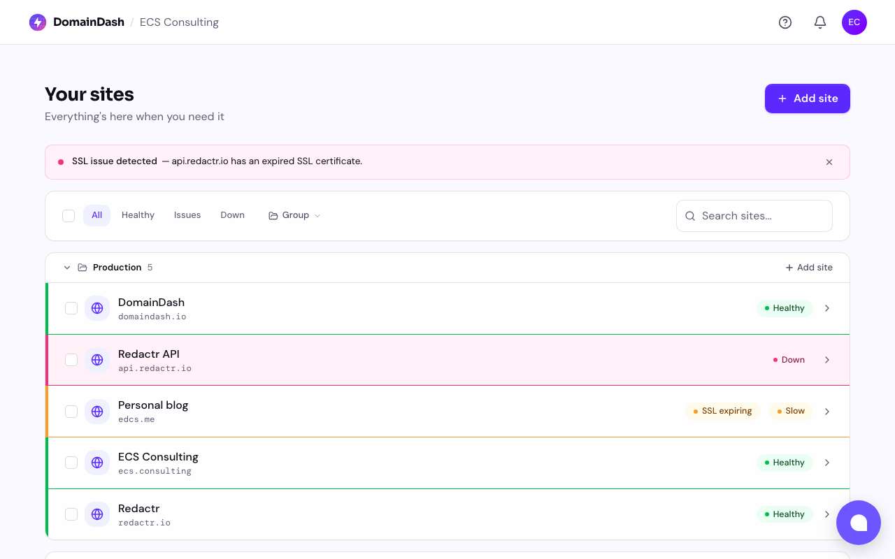
Before — the row-based table:
After — the card grid with the "all sites" summary top-left:
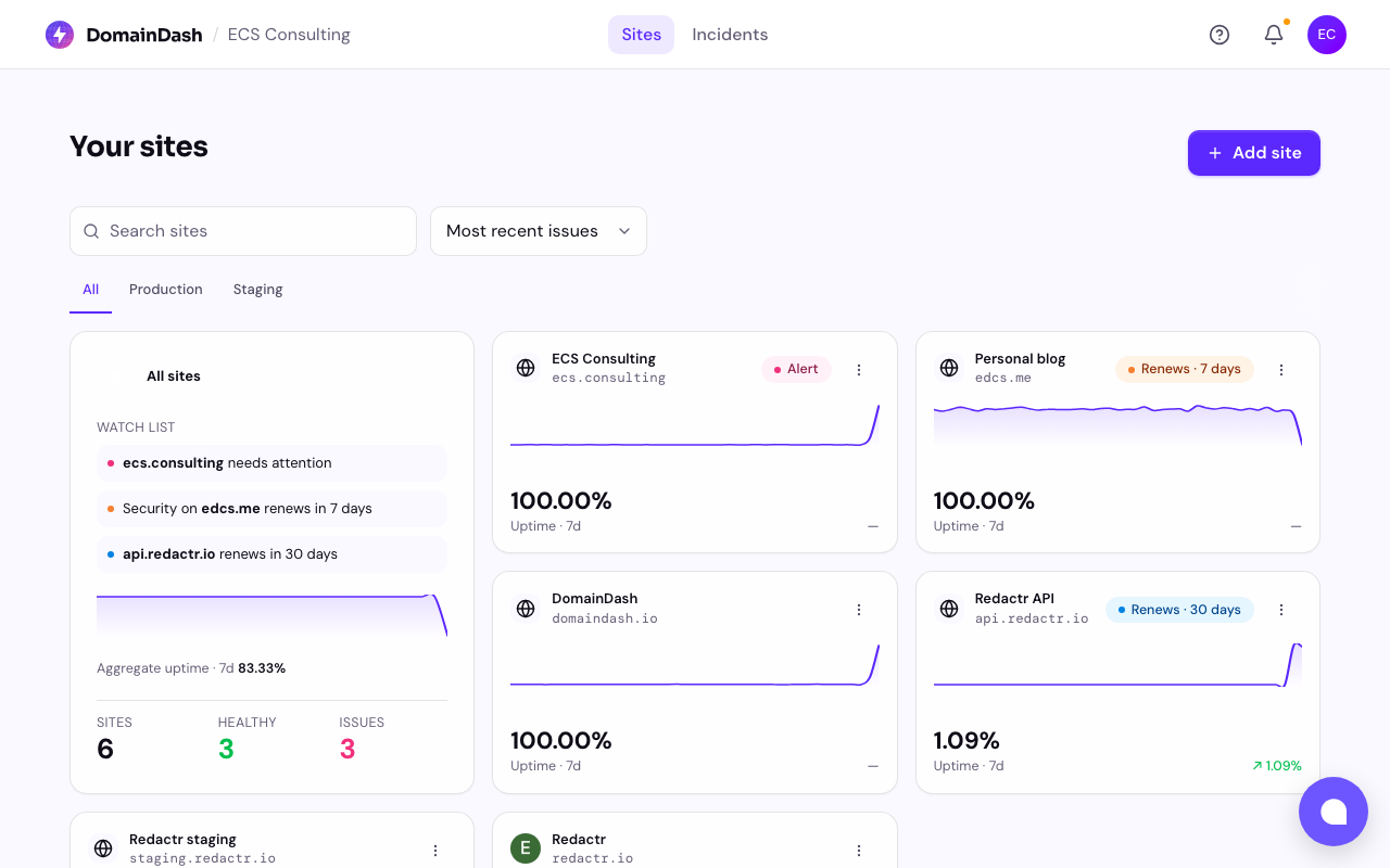
Cards instead of rows
Every site now has its own card: favicon, domain in monospace, current status, and a sparkline of recent response times. It's the right shape for "I have many small things and want to see all of them at a glance."
Rows are great when each item has a lot of structured fields you want to scan and compare side by side. Sites in DomainDash mostly don't. What you want is a quick at-a-glance temperature read on each, plus an obvious place to click through for the detail.
An "all sites" summary, top-left
There's now an aggregate card that sits at the top-left of the grid. It shows total sites, anything currently down or needing attention (red or amber if non-zero), and an aggregate uptime percentage over the period.
Before, you had to scan the rows to know whether anything was on fire. Now you don't. That single card is the room-temperature read.
The watch list
This is the bit I'm most pleased with.
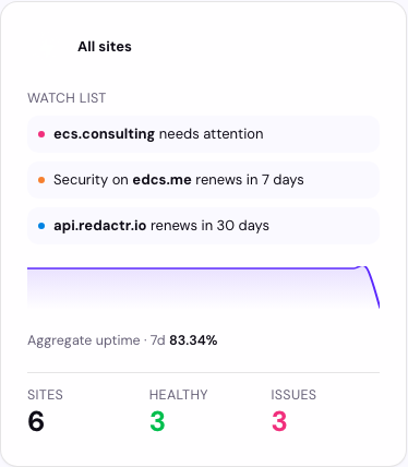
When something needs attention, the aggregate card surfaces a watch list of up to three concerns in plain English, with a +N more link if there are others. "SSL on example.com expires in 3 days." "redactr.io has been responding slowly for the last 2 hours." "DNS on api.acme.com is down." Click any item to jump straight to the affected site.
It's the section that turns the dashboard from a status display into a "what should I do today" list, which is closer to the actual job most DomainDash users are doing. They're not staring at a wall of green; they're trying to spot what's about to go sideways before it does.
The picker is intentionally cautious. It uses the same severity rules as the per-site cards (SSL and domain expiries tighten as the deadline approaches, slowness has to persist, single blips don't count), so the watch list doesn't cry wolf.
When everything's calm, the watch list steps aside and an on the horizon line takes its place, usually the next renewal coming up, so the card never feels empty.
That's the headline trio. There's more in the redesign (top nav, mobile bottom nav, progressive loading, plus live severity updates and an accessibility pass on the components), but those are stories for their own posts.
If you've been kicking the tyres, I'd love to know whether the watch list surfaces the actual things you'd want to know about. If it's noisy, or if it's missing something obvious, that's the bug worth hearing about — drop me a note on ed@domaindash.io or via the in-app chat.